 Chelsea Logo PNG
Chelsea Football Club holds a legendary status in British football. Established in 1905, it has become one of the most successful teams in the English Premier League. Under the ownership of Roman Abramovich since 2003, Chelsea has consistently showcased its prowess on the field. Led by the esteemed Frank Lampard and boasting a roster of world-class players, the club has gained global recognition.
Meaning and History
The current iconic logo of Chelsea is instantly recognizable worldwide. However, it underwent numerous transformations before achieving its present grandeur. Let's take a journey through the rich history of the emblem.
1905 - 1952
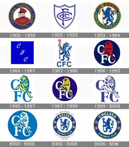
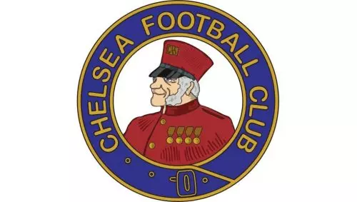
The inaugural logo of Chelsea featured a left-facing portrait of a pensioner encircled by the "Chelsea Football Club" lettering. Displaying shades of blue and yellow, the logo exuded stability and professionalism. This design bestowed upon the team the nickname "The Pensioners."
1952 - 1953

In 1952, Chelsea embarked on a brief redesign venture. The shield-shaped logo showcased the club's initials in blue and lasted for only a year. This unique heraldic shape was an exclusive addition to the Chelsea logo timeline.
1953 - 1964
The famous lion rampant, created by Ted Drake, emerged in the 1953 redesign. The blue lion grasping a yellow staff resided within a wide blue circle outlined in yellow. The club's name enveloped the frame, while five red rounded symbols adorned the upper part. This design has become iconic in Chelsea's visual identity.
1964 - 1967

Chelsea briefly deviated from the lion motif from 1964 to 1967. A simple blue square bearing three ornate white letters, "CFC," occupied the emblem's space. Although modest, this logo didn't endure, and the lion swiftly returned.
1967 - 1986
The 1967 design showcased a white lion rampant with a red staff on a blue background. The "CFC" inscription appeared below the lion, while additional elements such as the FA Cup and two white stars celebrated the club's victories.
1986 - 1995

Le Coq Sportif brought a complete visual identity transformation in 1986. The revised logo featured a red lion emerging from a navy-blue circle. The "FC" lettering emerged from another "C" placed above it. Over the years, the logo's color palette evolved, with the yellow and blue lion giving way to a yellow lion against a white inscription and a vibrant blue background. Subsequent experiments resulted in a navy blue image on a light sky blue background and eventually a white symbol within a tranquil blue circle.
1995 - 1997

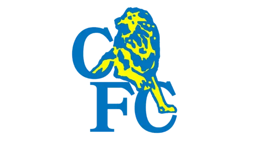
The 1995 refinement introduced a blue and yellow lion with a monogram against a plain white background. This color scheme injected progressiveness and vibrance into the logo, enhancing its appeal.
1997 - 1999

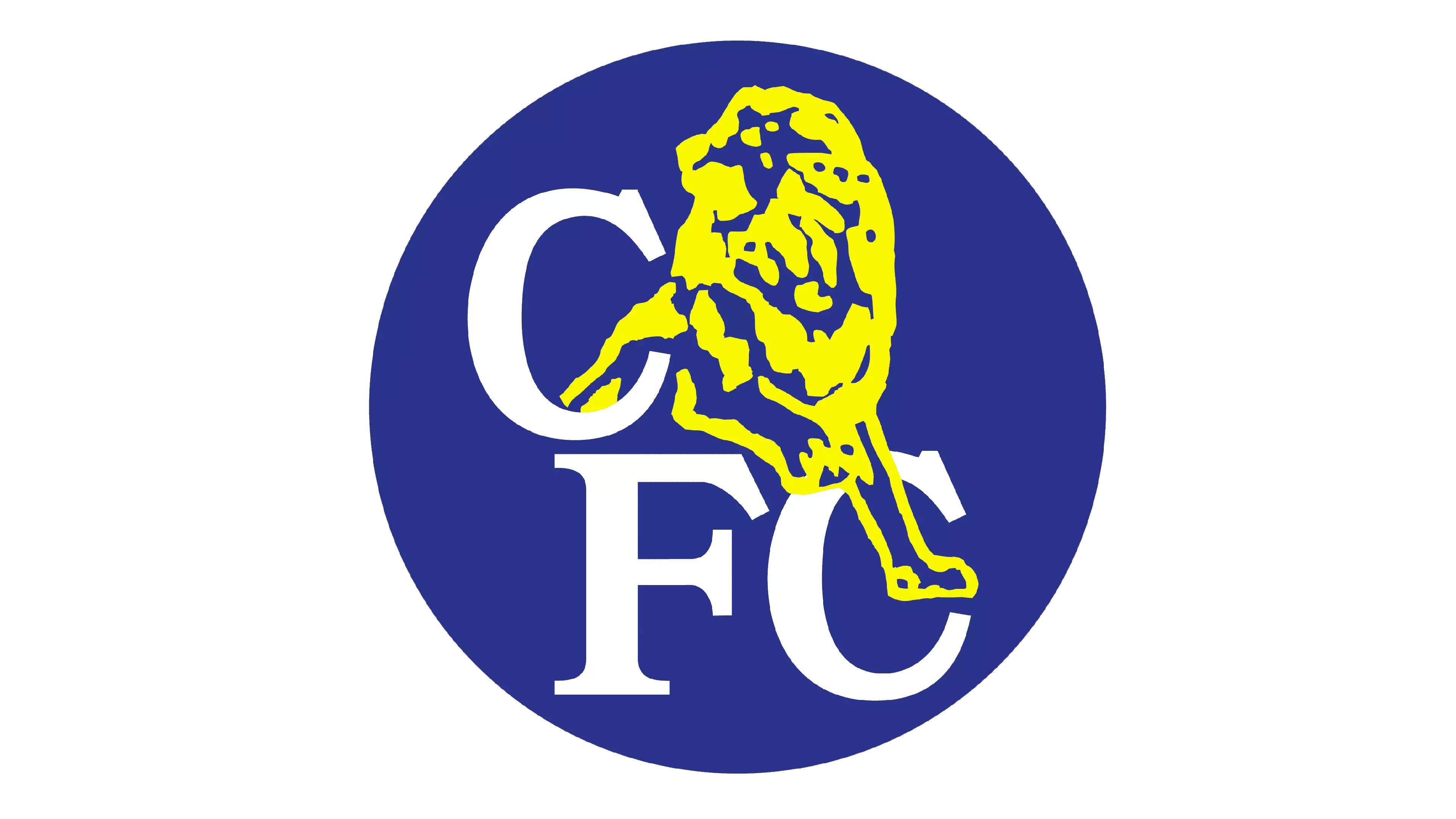
In 1997, Chelsea reverted to a deep and vibrant blue roundel highlighting an acid-yellow lion and white lettering. This stunning redesign graced the club's emblem for a couple of years.
1999 - 2003
Returning to simplicity, the 1999 logo showcased the lion and monogram in blue against a clean white background, eliminating the roundel. This design exuded a sense of confidence and strength, portraying Chelsea as a formidable force.
2003 - 2005

The 2003 redesign marked the final version of the Chelsea badge featuring the lion and monogram. The emblem, drawn in white, sat on a solid blue roundel. The soothing shade of blue exuded stability and elegance, complementing the symbol's overall allure.
2005 - 2006

To celebrate its 100th anniversary, Chelsea introduced a refined version of the lion rampant. The lion gained depth, and the background became light blue. The gold details adorned the framing and lettering. This logo, accompanied by the golden inscription "100 Years Centenary," lasted for only a year.
2006 - Today
In 2006, Chelsea bid farewell to their anniversary lettering, replacing it with red details symbolizing passion and power. The staff, lion, and frame emerged in matching shades of blue, while the lion's tongue appeared in red. The inscription, executed in white and yellow, stood out effortlessly.
The all-caps wordmark, utilizing a bold and elegant sans-serif typeface resembling Chong Old Style Pro font, exudes expertise and authority.
Symbol

Today's Chelsea logo bears a striking resemblance to the emblem utilized from 1953 to 1986, with minor alterations. The lion rampant regardant clutching the staff of the Abbots of Westminster remains the symbol's centerpiece.
Emblem

Introduced in 2005, the current Chelsea logo emblem has garnered immense admiration from fans and the team alike.
Shape
The Chelsea logo comprises a lion rampant regardant enclosed within a blue circle outlined in gold. This circle bears the club's name, two balls, and two roses, representing England's national symbols.
Colors
The Chelsea logo displays a combination of blue, white, yellow, and red. These colors represent energy, elegance, excellence, and perseverance, highlighting the club's exceptional characteristics.
Font
The club's name is elegantly written in a sans-serif typeface, exuding confidence.
Chelsea Colors
- Blue: PANTONE - PMS 7687 C, HEX COLOR - #034694, RGB - (3, 70, 148), CMYK - (100, 83, 10, 1)
- Red: PANTONE - PMS 1788 C, HEX COLOR - #EE242C, RGB - (238, 36, 44), CMYK - (0, 98, 91, 0)
- Gold: PANTONE - PMS 7555 C, HEX COLOR - #DBA111, RGB - (219, 161, 17), CMYK - (15, 37, 100, 1)
- Light Blue: PANTONE - PMS 2115 C, HEX COLOR - #6A7AB5, RGB - (106, 122, 181), CMYK - (64, 51, 4, 0)
- Gray: PANTONE - PMS 427 C, HEX COLOR - #D1D3D4, RGB - (209, 211, 212), CMYK - (17, 12, 12, 0)
The Chelsea logo's evolution is a testament to the club's rich history and enduring spirit. From its humble beginnings to becoming a symbol of excellence, Chelsea's logo reflects the team's journey towards greatness.


